Rick's b.log - 2017/03/05
You are 3.21.159.223, pleased to meet you!
Rick's b.log - 2017/03/05 |
|
| It is the 21st of November 2024 You are 3.21.159.223, pleased to meet you! |
|
mailto: blog -at- heyrick -dot- eu
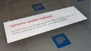
Yesterday, I fired up Google Docs on my iPad to be greeted with this:
Yes, I am using an older version of iOS. Version 7, to be precise. But, at the same time, I am also using an older version of Docs that is now blocked from working, at all, even locally. Start up Docs with WiFi off, it's the same message. Google, in their omnipotent wisdom, have decided that iOS 7 is too old. The end.
Why have I not updated? It's actually quite simple - the iOS7 update was a mite over 2GiB. It took ages to download. The iOS8 update was quoted as two and a half times that. For what actual benefit to me? A slightly later version of Safari? An email client that might even be more broken than it already is? [iOS6 did IMAP, iOS7 just stores everything locally forever] Yet another pointless and irritating UI design change?
But, you know what? It's okay. It really is. You, Google, arbitrarily killed off Google Translate on iOS7 last year. You've killed off Docs this March. I'll still use Docs on my phone, with its greatly smaller screen. It's the simplest way to work on written documents on the go and be able to get them to a "real computer", because something Android really lacks is a decent word processor app that "just works" without devoting screen space to distracting advertising.
But, you know what? It's okay. It really is. Because I like Google products, I find them useful, but I know - never trust Google. Some day you'll get bored of a product and kill it, or decide to wipe out all the older devices "just because", effectively arriving at the same result...
Don't get me wrong here - I don't expect app devs (even Google) to support Android 2, iOS 4, etc etc. What I do expect is that an app that has not been updated running on an OS that has not been updated work just fine one day, and upon instructions from the mothership, suddenly cease working. The message above is a blatant lie, that combination of software has worked perfectly for years. Now it doesn't work at all.
As I'm both a Brit and a Scot, let's start with "stuff that sucks".
Here is the Samsung keyboard in its compact-but-detailed mode (the symbols are optional, as are the numbers):
Here is the Google keyboard:
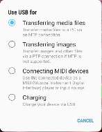
Given the USB OTG adaptor, wouldn't it be great if the phone could be a controller, able to be plugged into a keyboard or synthesiser?
More rocks than sucks. That's a good thing. ☺
Google knows best
It seems that Google is on a crusade for the latest greatest even when such a thing is not necessarily in the user's best interests. I've already commented on the lunacy of their blind push for https everywhere, completely ignoring that there are many sites (such as this one) that don't really have a need for SSL, that SSL itself is inherently insecure (a huge number of public APs will try to foist man-in-the-middle certificates on you, and non-geek users will probably be told "oh, just tap on Accept" without realising exactly what they've just done).
Screw you, Google.
The size of the download is the main factor. It would tie up the connection for a day, maybe longer, and if the downloader is stupid and cannot resume (don't laugh Google, your crappy Google Play Services back on Android 2.3 did exactly this, causing my phone to burn through a hundred odd megabytes of failed downloads - and I know it was you as I had an app that took snapshots of newly downloaded APKs, and there they all were - all with different sizes, downloaded on 3G on my paid-for tariff because you're just too goddamn precious to obey the "only update on WiFi setting" and you're too goddamn stupid to do it correctly).
And for what, I ask you again? Just like Android, iOS does not support modular updates. There is no "choose your options" interface to allow the updater to pick what you want, it's an all or nothing kind of deal. So the OS size more than doubles so I can get Retina imagery that are of no use (it's a non-retina display). So I can get connectivity and support options for Apple smart watches and such that I'll never own. It's a 16GB iPad Mini that works. Please provide me with a decent sensible use-case that justifies the massive loss of storage (we're looking at the OS claiming nearly a third for its own use now - that's iOS 8 that I never upgraded to, I'm sure iOS9 and 10 are greater space hogs).
Sorry, no, I do not accept vague mumblings about "security" as a justification. My iPad is not "jailbroken" and I don't run dodgy apps, so it's probably the most secure device in the house right now.
Will you, by any chance, be restricting/blocking Google Docs on older Android phones? My Xperia U is running Android 2.3.7 and never once, in the two years following purchase (purchased when Android 4 was a thing), not once was there an OTA update.
Oh, wait, I can't even check on my Xperia U - Play opens and just says "Item not found". That's it. Jolly good show!
But it's okay. It's what we have come to expect from Google.
Samsung S7
Having used the S7 for a couple of weeks now, I will let you know how things are getting on.
Sucks: the keyboard
Let's face it, the swipe-type keyboard on the S5 was just nice. It made logical suggestions in both English and French (so I could choose words in a multilingual way without messing around switching virtual keyboard layouts), it worked nicely with Firefox, and it was pretty accurate.

The keyboard has been set up to support UK English, French, and Japanese, however these are distinct languages and as such you can't write French words in English mode like on the S5.
The Samsung keyboard handler suffers from a critical flaw when used with a physical (USB or Bluetooth) keyboard. It interprets the easy-to-type combination of Shift and Space to be a hotkey to switch the keyboard language.
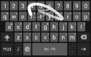
I might have sussed the multilingual thing. It seems to learn the language you are using and then stick with it. I swiped "On peut dire que mais alors my good friend" (don't translate, it's gibberish) and the phone took that as "On peut dire que mais alors j'y vois forme".
As for Nightwish... "Nigerian" was GBoard's best guess.
Sucks: MIDI
Sucks: Temperature
Hardcore processing causes the device to heat up dramatically. Actually, I suspect it might seem hotter because I'm betting the metal edge frame is really part of the heatsink arrangement. Now, getting warm isn't unusual when we're talking about multiple cores at high speed in a very enclosed space, however the increase in degrees is almost always offset by a corresponding decrease in battery charge percentage.
The thing that really whammies the phone is to do complicated screen manipulations. For example, the cardboard/streetview apps when running in 3D VR mode warm the device up. But what absolutely turns the thing worryingly hot is using Google Navigation. GPS, 3G, and real-time screen movements all combine to something that felt really quite hot. We must have been looking at 50-60°C on the outside.
By utterly inexplicable contrast, playing a 720P HEVC video using MPlayer's software decoder (there's no direct hardware support for HEVC, it takes a phone this powerful to cope with it) barely warmed it up at all. Hmmm?
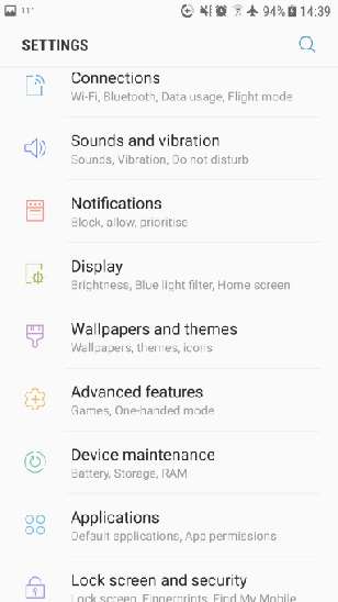
Sucks: The "settings" organisation changes frequently
Everything is now buried in "categories". This way of presenting options may be better for newbies to Android, however I find that things that were fairly simple to access using previous versions of Android are now several taps further away. Like the "Search networks" to see if/what you are receiving. Thank goodness there's a search function.
Rocks: Enhanced quick settings
Once upon a time you had to install home screen widgets in order to do really simple stuff like turn airplane mode on and off. Later versions of Android had easily accessible toggles at the top of the notification bar to make it simpler.
Now? Those toggles are still there, but swipe down once and the notifications will appear. Swipe down again, and easy access to common settings will appear.
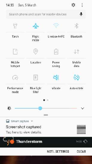
Rocks: Even more enhanced quick settings
Those quick settings? Also available from the lock screen.
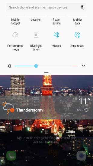
Rocks: Blue light filter
It is starting to become better known that too much high energy (blue) light at times when the sun is not out will mess with the production of melatonin. Long story short, too much blue light from TVs, tablets, and computer screens too late in the day will mess with sleep patterns. Sometimes dramatically.
I have set my blue light filter to kick in at 8pm. At that time, everything becomes reddish as the blues are stepped back. I'm not sure if this actually does anything useful but it's a good start at taking this issue more seriously.
Rocks: Power management
When you aren't doing activities that turn the phone into a roasting kebab, the S7 includes some fairly aggressive power management. I'm not sure if this is default Android or something Samsung, suffice to say that a system monitor will "sleep" apps that are doing things when the phone is expected to be idle.
My S5 used to lose between 20%-30% sitting in my locker doing nothing. The S7 is much more efficient. I can come home and watch Angry Grandpa destroying stuff before I need to think about plugging in the charger. And that's the standard mode, not one of the optimised ones.
Rocks: The screen
Let's face it, QHD (2560×1440) is a ridiculous resolution for a five inch display. But, hey, it's really lovely to look at. As with the S5, it is an AMOLED panel so each pixel actually emits light. As such, the blacks are sublime. No more of the TFT LCD problems where decent whites were only possible by turning the brightness up (making the blacks a sort of murky dark grey), and decent blacks were only possible by turning the brightness down (with the obvious side effects).
Rocks: USB OTG
Plugging in a keyboard with touchpad? No problems. Plugging in an SD card via USB reader? No problems.
No comments yet...
| © 2017 Rick Murray |
This web page is licenced for your personal, private, non-commercial use only. No automated processing by advertising systems is permitted. RIPA notice: No consent is given for interception of page transmission. |