Rick's b.log - 2021/12/02
You are 3.141.198.147, pleased to meet you!
Rick's b.log - 2021/12/02 |
|
| It is the 21st of November 2024 You are 3.141.198.147, pleased to meet you! |
|
mailto: blog -at- heyrick -dot- eu
Note that I wasn't able to locate the palette data, so I've done it manually and this may be incorrect. Each tile is 8×8, and has four bits per pixel (16 colours), out of a possible palette of 64 colours (six bits in the form RRGGBB). I have rendered the background as light grey, whereas it may be black or transparent or something in reality.
The reason that tiles are used, whether combined or separate, is that it is quicker to draw a picture by arranging tiles to be a wall, a road, and island... whatever, and to then paste over the top your car, a hedgehog, aliens... fairly complicated looking displays can be created using really rather mundane hardware and very little in the way of resources.
The Master System display is built in two planes. The first plane is a background layer, which represents 32×28 tiles (896 tiles in all). If you do some maths, you'll note that the screen height (192 pixels), only accounts for 24 tiles. The extra is to allow for scrolling, which is performed smoothly by altering offsets. If you do some more maths, you'll note that there is no actual excess for horizontal scrolling. 256 pixels is exactly 32 tiles. The way around this is that the video chip can blank out the leftmost eight pixels, effectively hiding whether or not there is a tile there. By making clever use of this, and the display offsets, scrolling can be achieved in any direction.
The second plane is the sprite layer. These are up to 64 sprites that can move around freely. A sprite is either a single tile, or two tiles stacked vertically. (8×16). There is a limitation in this device in that the video chip can only cope with eight sprites per horizontal scan line. Something extra that made the video chip special was built-in collision detection. It didn't tell you which sprites collided, only that there was an overlap. But examining the sprite's status would indicate which ones were involved.
To put this into all perspective, here are the tiles used to create the 'ghost' character (assume the grey is a 'mask' and would be drawn transparent):
Thus, in total, the game console would offer around 8K of system ROM, 8K of RAM, and up to 48K of card or cartridge ROM (if more was required, it was banked). Couple this with an additional 16K private to the video chip for holding tile data and the description of how to build a screen (this was not memory mapped) and you have a complete third generation mid-eighties games console.
For reference, the competitor, the SNES (Nintendo) is even less equipped. With a 6502 processor clocking under 2MHz (depends on NTSC (1.79MHz) or PAL (1.66MHz)), 2K of program RAM, and 2K of video RAM (yes, only 2K!), and a mite under 50K directly accessible through the cartridge slot...though often games offered a lot more and used bank switching (or a "mapper" in SNES terminology - the MMC3A chip usually did this). Everything is memory mapped.
Why am I talking so much about old games consoles? Partly because it's pretty amazing how they did what they did with such frugal resources, and also partly because this design is what helped define a lot of the look and feel of the platform games written for these consoles.
I made a simple mockup in BASIC. The 'tile' was just a blue sprite with a white border and cross, and the word 'tile'. I drew a simple 'girl', and a really crappy ghost that honestly looks more like The Ood from Doctor Who. All were drawn in Paint in... about fifteen minutes. Most of that was making the girl look right.
I had spent "a while" at work fretting away over how to render the tiles and objects. As I was using a 256 colour mode, it was a simple case of each pixel being a byte. So byte reads and writes would do it. I could even optimise and switch to word accesses when the tiles are aligned to a boundary of four pixels. But then came along numerous complications. For starters, transparency. Should I have a non-transparent drawing routine for the tiles, and one that supports transparency for the objects? Or the same routine for both? What about clipping? That is to say, things that go off the left and right of the screen. It'll only want to be part drawn.
Well, after writing the above code, in BASIC, to help me visualise what things will look like, I decided to add in some movement. The picture above is actually of the movement test. That's why there are so many ghosts. I simply stuffed an array of ten ghosts with random offsets, and each frame moved them all to the left. The green circle was plotted on top of everything and it moved to the right. When something was off the screen, it would reappear on the opposite side.
All of this was written in BASIC and using the standard OS SpriteOp calls, and it was happily chugging away at fifty one frames per second on a Pi2.
Something of an irony is that the status header design was just sort of "thrown up there, to be thought about later on" and apart from a few tweaks and sprucing up here and there, it's actually remained pretty much the same. The "Lives", "Fear", and "Film" captions were only supposed to be placeholders, but I kind of grew fond of them. They were 'quaint'.
Something that became clear was that the status header was a bit cramped. And 220 was an odd height. So I reduced the tile height to 200 pixels. I added a twenty pixel tall 'top row' to allow rooms to be tidily 'closed', this left 100 pixels for the status (rather than 60 and no top row). With these changes made, I and had a crack at drawing some actual tiles. Again, by hand, in Paint.
And this is why Lucy wears a blue dress, not a black one!
For whatever colour depth the screen was, the sprites and tiles would need to match, otherwise every plot would require colour translation which would take time, so the sprites are all 256 colour without palette (so can be directly plotted to the screen as they'll use the default colour set).
I think, using 720P HD, that Mamie may be RISC OS' first HD platform game. And possibly (though I've not checked), the first native HD game?
So I decided to throw away those tile drawings and instead automate the process. I wrote a program that knows how to draw bricks, and had it draw all the bricks in all the right places. For the half bricks, it actually draws whole bricks, plots the grout line down the edge, and then draws a black rectangle over top of the remaining bits of brick that aren't wanted. This black-out method was also used to draw the hole in the floor.
The bricks were carefully designed, by lots of testing of different sizes and concepts until I arrived at a description of the brick used in the game:
This gave tiles that look like this (brick, and concrete).
Putting these all together, we arrive at something much closer to how the game looks now.
The background tiles are sprites with a fixed black backgound, and everything else is a sprite with transparency that it plotted on top. The RISC OS Sprite system actually does a superb job of plotting all of this to the screen, including paying attention to the transparency. It does take some time, however, especially when the tiles are not aligned to a processor-friendly value.
You will feel this on the original Pi1 where things will seem smooth until the screen starts to scroll, at which point everything will slow down (expect around 35fps maximum on a Pi1). Older machines such as the Iyonix will be even worse. It is for this reason that the minimum realistic specification for the game is a Pi2. It's what I originally used, and it is so much faster than the Pi1, architectural improvements (Pi1, ARM11; Pi2, Cortex-A7 core) offer a lot more than can be explained by a simple 200MHz speed bump.
In tomorrow's installment, I will discuss the BASIC test code (which is actually what the "third mockup" is a screenshot of), and some ideas tested and rejected.
Advent 2021 day 2
Whee! More chocolate! ☺
Mamie Fletcher's House 2
A world of tiles
Games such as Ghost House, or pretty much any platform game, lend themselves to a style of graphics known as "tiling". The game hardware, in this case a Sega Master System runs a Z80 CPU which is connected to a special video chip called the VDP (an enhanced TMS9918). This will generate images that are 256×192 from a set of tiles stored in memory. The tiles for Ghost House look something like this:
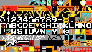
Ghost House scenery tiles.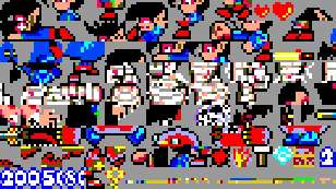
Ghost House character tiles.
There are also some missing letters, so not sure what's going on there.
Each display entry consists of two bytes. One is the tile reference, and the other represents attributes. That is to say, whether this tile has 'priority' (is drawn in front of sprites), and whether it is vertically and/or horizontally flipped. You can see this, for example, in the second-to-last row of the scenery tiles, in the second-to-last colunm. That yellow thing with the black bit over it is half of a light. The other half is the exact same tile, horizontally flipped.
![]()
![]()
![]()
![]()
![]()
![]()
Technically the SNES outputs 256×240 using a similar tile-based system, but because of video issues, NTSC would output about 224 visible lines, while PAL would output 288 lines. It sounds to me like PAL images would have been slightly letterboxed.
The machine can get away with such a small amount of video memory, as the tile definitions are held in the cartridge and it's all memory mapped, so the video chip can access them directly, unlike the SMS which had the video RAM private to the video chip and not memory mapped.
Tiling Mamie
When it came to Mamie, I knew that it would be built using tiles. I wasn't keen on attempting to construct a world using 8×8 tiles. So what I decided upon, by basically farting around trying different things, was a tile that was 64 pixels wide, and 220 pixels tall. As the game was intended to be 720p HD, this would give three levels in height, along with twenty tiles across the screen. A simple status header would take the remaining 60 pixels at the top of the screen.
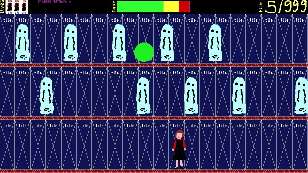
A tile mockup.
And all of this has to happen in realtime, from nothing, at least fifty times a second.
The player character was controlled by the Z and X keys.
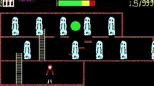
The second tile mockup.
The mechanics ware the same (ghosts to the left, ball to the right, X and Y for the girl) but now it was starting to look like Lucy's world. We're down to 45fps, but there's no optimisation whatsoever and it's still in BASIC.
Screen resolution
I decided fairly early on that the game was going to run in HD mode (1280×720) using 256 colours. This was because, actually, there aren't that many colours in the game. I could have possibly gotten away with 16, except this is not supported on many contemporary systems, and full colour (24 bit or 32 bit) is just overkill. Plus, it's pleasing to have one byte be one pixel. It's easy to work with.
Given that AmCog's Haunted House also runs in 256 colour 720p, it's like a London bus - two come along at once! Tony and I can have a good natured argument over "who was first"; though honestly I think they both pretty much developed around the same time, as the use of more modern hardware and the ubiquitous nature of widescreen televisions and monitors means that using 720p was pretty much a given. Having a square screen (like 800×600 or whatever) looks a bit...dated.
Creating the tiles
It was a pain drawing each brick in turn, especially if I wanted to play with the sizes of things and have bricks that match up. It's hard to see in the reduced size screenshot above, but where a column meets the floor above, the topmost brick of the column is half-height. That's just... really bloody lame.
For concrete, it was much the same idea, only this time it draw an entire tile in randomised shades of grey, and used black to knock out the unwanted parts in the tile. Ditto aether, but different colours.
Floor (brick effect) is 16 pixels tall.

Grout is colour 211.
Brick is colour 17.
Top and right edges of brick are colour 16.

Each brick is 4 pixels tall, and there is one pixel for grout.
This means a row height is 40 bricks tall.

Bricks are fifteen pixels wide, with a pixel for grout. This
means the overall size is 16 pixels, for four across the tile.

End is offset by 7, so grout on pixel 8, like this:
XXXXXXXXXXXXXXXXXXXXXXXXXXXXXXXXX
X 1             X               X
X123456789012345X123456789012345X
X 3             X               X
X 4             X               X
XXXXXXXXXXXXXXXXXXXXXXXXXXXXXXXXX
 1234567X123456789012345X1234567
        X               X
        X               X
        X               X
XXXXXXXXXXXXXXXXXXXXXXXXXXXXXXXXX
![]()
![]()
![]()
![]()
![]()
![]()
![]()
![]()
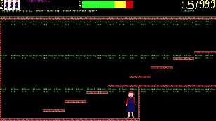
The third tile mockup.
No comments yet...
| © 2021 Rick Murray |
This web page is licenced for your personal, private, non-commercial use only. No automated processing by advertising systems is permitted. RIPA notice: No consent is given for interception of page transmission. |