Rick's b.log - 2021/12/04
You are 3.133.152.26, pleased to meet you!
Rick's b.log - 2021/12/04 |
|
| It is the 21st of November 2024 You are 3.133.152.26, pleased to meet you! |
|
mailto: blog -at- heyrick -dot- eu
The original design of Lucy was hastily thrown together in Paint, so I'd have something visual to work with in the mockups.
At this time, the sprite was simply called "girl" as I hadn't thought about a name for her. But, it became really obvious really quickly that a character dressed in black on a black background was not a smart idea. So the sprite was copied and recoloured. As I copied the sprite, I typed in the word "lucy" for the new one, and, well, that's how she got named. It just happened to be what popped into my head at the time, rather than something dumb like "girl2".
Of course, when you're playing a platform game, you tend to need to have the characters be seen from the side, not the front.
The first sideways version of Lucy looked like this.
This was again, drawn pixel by pixel in Paint, as a mash-up of a photo of myself taken from the side, and also using various images of girls aged around 14-20 found online. There was one site, I think "123rf" or something, that offer loads of images. I just downloaded various blatantly watermarked previews and used them for doing things like getting the proportions looking right.
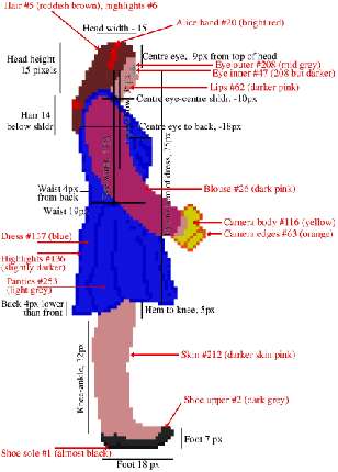
As for the proportions, well, it was all calculated.
Why all the detail? It was intended for setting up some parameters for animating Lucy. And that's the topic of tomorrow's article.
Advent 2021 day 4
As it turns out, the UV thingy does work. It just needs the button pressed for three seconds and the lamp to be held completely horizontally (facing down).
Mamie Fletcher's House 4
Creating Lucy
There were three primary considerations when making the protagonist character.
![]()
The very first 'girl' sprite.![]()
The original Lucy sprite.
However, a scaled down version of this design still lives on, as the little indication of how many 'lives' you have left.
The Lucy as we know her
The original Lucy was too big, her head would crash through the floor above when jumping. This still happens a little bit, but it's not as noticable. There's a trade off between jumping ability and character height. I didn't want to make Lucy too small, but she has to be able to jump over holes and on to steps.
![]()
Lucy jumping.![]()
The redrawn Lucy sprite, the blouse was later lightened,
and the camera made larger and yellow.
There are things that you don't really think about, such as the eyes of a person might 'seem' to be near the top because they're at the top of the face, however when taking the head as a whole the eyes are actually about halfway. Likewise, a human torso is pretty small compared to the legs. Plus, for some reason that I've never really figured out, the apparent "waist line" of a dress is somewhere near belly button height. Perhaps this is to visually enhance the length of the already long legs?
Also, the boobs stick out the front (duh!), the buttocks protude from the rear (which draws in the waist), and the back as a whole is somewhat concave, an effect that appears to be dramatically enhanced by wearing heels. But Lucy wears flat shoes as she'll be running from ghosts, not dinosaurs. ☺

Lucy's sizes and colours.
No comments yet...
| © 2021 Rick Murray |
This web page is licenced for your personal, private, non-commercial use only. No automated processing by advertising systems is permitted. RIPA notice: No consent is given for interception of page transmission. |