mailto: blog -at- heyrick -dot- eu

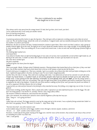
You are not reading my b.log using HTTPS. You can switch to HTTPS by clicking here.

Google Docs and epub

My as-yet-unfinished novel...which is probably more accurately described as my will-never-be-finished novel...is being written in Google Docs.

The outline was written in OvationPro, but it very quickly became apparent that if I was going to make use of the hours that it took mom to under the PET scanner, I'd have to leave RISC OS behind.

So armed with a crappy little tablet, a battery pack, and an equally crappy BLuetooth keyboard, I set about writing. It helped to take my mind off of the unpleasant things that such scans involve.
I continued while mom was in hospital and I was on my summer holiday. I didn't have any car at that point, so was stuck at home and - again - it helped to take my mind off of things. Mom didn't want to talk to me much, she hated being ill, and when she did talk it was mostly about how awful and abusive some of the staff were. And there I thought Pontchaillou (Rennes), being a teaching hospital, would have been a good place to go. Don't get me wrong, the people in the scanner unit were really friendly. Those in the dermatology unit, quite the opposite.

Anyway, enough of that. Today's story is about Google Docs. Now Docs is an interesting beast. For the best amount of functionality, you want to completely ignore the app and use the website. It behaves like, say, Word 97 or somesuch. Clearly, however, this approach isn't suited to a mobile device. So there's an app. But it's an app that is a greatly simplified editor. When it came to things like section headings (to give each chapter a different title at the top of the pages), I needed to use the website (my phone running Firefox in desktop mode) to set that up, and the app to do the actual writing.

Docs it, itself, largely based around making PDFs. If you download a file, you get a PDF. If you print a file, the PDF is downloaded and then printed. I've not done much with Docs in the last couple of years, but when I used it a lot in the summer of 2019 it rather suffered from a flaw in that what the browser showed, what the app showed, and what the eventual PDF looked like were all subtly different. Often minor things, but even a minor change can throw off the alignment of tabbed columns, or leave an orphaned word on an otherwise empty page.

When you rummage around Docs, it is possible to save a copy of your document in various popular formats. This is the three-dot menu, Share and Export, then Save as.
Options are Word, PDF, OpenDoc, Plain text, RTF, zipped web page, and epub file.

Well, I have a little ereader, my Pocketbook Aqua, so epub would be perfect, right?

Well...

Too small to be readable
Too small to be readable.

That is on a six inch (diagonal) screen. That means it's 91mm × 123mm. Far too small to support text like that. Each line of text was, maybe, six or seven pixels in height.

Here's a zoomed up version.

Anti-aliasing
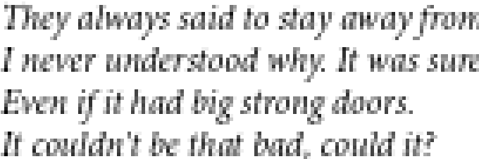
Anti-aliasing.

While that may seem perfectly legible if you move back from your screen (a little less, if your eyes are as crap as mine), on a small eink display of around 600×800 dots and theoretically 16 shades of grey. It is worth noting that the background is sort of silver (not white), the contrast is a lot lower than your screen, and there is always ghosting effects from one page change to another.

Which means that what you actually see is more like this.
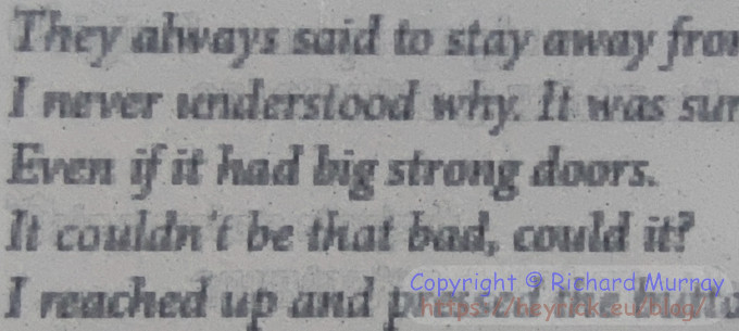
Too hard to read
Too hard to read.

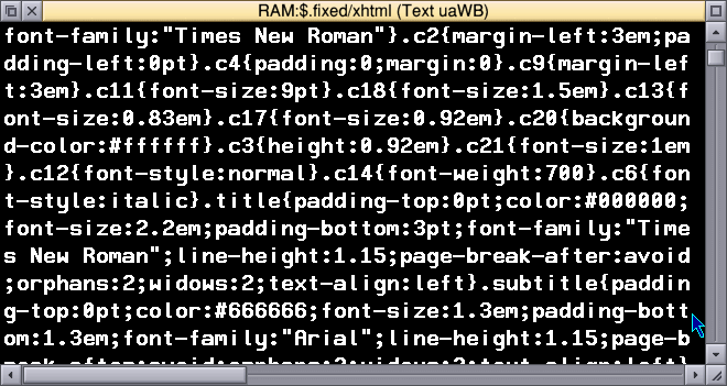
Now, I cannot change the technology of eink displays, nor am I going to buy a reader with a larger/better screen.
There's an easier answer. Accept that the output generated by Docs is absolutely awful bloated nonsense and needs fixing. I could, perhaps, throw the file into Calibre to fix it, but that needs the big PC running and, oh, what a lot of bother. Isn't there a simpler way?

Well, the first step is to identify what's actually going wrong. Lukcily, it's pretty easy to spot. Here's the source of the problem.

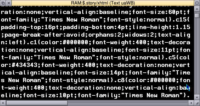
This is hard to read, too!

Look at all those embedded text sizes. 60pt, 16pt, 11pt... Ugh. The reader software (AdobeViewer, I think) is interpreting those and trying to, literally, display that. Because my ereader is a little Linux based computer, it probably thinks the display panel is an actual display.
Now, other software on other devices may be smarter. I don't have a problem on my phone with eReader Prestigio because either that has a completely different idea of what "12pt" is, or it fudges the text size on the understanding that the user isn't going to be wanting some fifty lines of text on a small display panel.
AdobeViewer does have a way of setting up the desired text sizes, spacing, and margins...but the fixed sizes specified override those defaults.


As such, there is a much better solution that's quite apparent. One that Google ought to have adopted for epub. Instead of writing in absolute text sizes (which, incidentally, defeats the ability to resize the text), simply determine what the body text size is and set everything to be relative to that.

The body text is, therefore, "1 em". An em in text sizing means "the default size". For many documents, this is 12 point, and it is what I'm assuming here as I really can't be bothered to try to parse that markup to determine what's the body text. This is supposed to be a quick fix, not a deep dive.

Then, you simply calculate the result of the desired size divided by the default size. For instance, if your title is 24pt, then 24÷12 is 2. So it's 2 em.
Likewise, if your copyright blurb is slightly smaller at 10pt, then 10÷12 is 0.833333333, but since we're talking text sizes, that can simply be rounded to 0.8 em.

I wrote a little BASIC program to whizz through the document looking for colons. If it found a ':' which was followed by one or two numbers and then "pt", it would replace the fixed point size by a relative em size.

Which led to markup that was still bloated and awful, but with sizing that actually worked.

Less naff
Slightly less naff.

Which leads to this appearing on my ereader's screen.

That's better, nicely readable.

Better yet, if I'm outside and there's sun and shadows and distractions, a quick pinch out and...

Even more readable
Even more readable.


Some code? Oh, okay then...

Sorry, if you're not using RISC OS. It's BBC BASIC as it's just a little something I threw together to deal with this specific use case. There will be better methods and better algorithms. Like I said, this was just thrown together to bash Docs' shonky output into something that worked on my ereader.

REM >GDepubFix
REM Rick's simple epub fixer
REM
REM Because Google Docs *hardwires* absolute
REM text sizes into the document, and that
REM goes REALLY wrong on some *actual* ereaders
REM that try to obey the sizes specified.
REM
REM (C) 2023 Richard Murray
REM http://heyrick.eu/blog/index.php?diary=20230714
REM
REM Licence: "I don't give a ****."
REM If your jurisdiction needs more words, assume CDDL.
REM

REM Input file BASE, treating .epub as an open .zip
base$ = "Belinda7/zip.GoogleDoc."

i% = 0        : REM Input file handle
o% = 0        : REM Output file handle
fl% = 0       : REM Length of input file
REM buff%     : REM Block of memory for buffering input
off% = 0      : REM Offset into buffer
b% = 0        : REM Byte read from buffer
nh% = 0       : REM Number-high (tens) read from buffer
nl% = 0       : REM Number-low (ones) read from buffer

REM Copy the original as "OldVers"
OSCLI("Copy "+base$+"Belinda7/xhtml "+base$+"OldVers/xhtml ~CF~P~V")
i% = OPENIN(base$+"OldVers/xhtml")
ON ERROR CLOSE#i% : PRINT REPORT$+" at "+STR$(ERL) : END

REM Then block-load it in
fl% = EXT#i%
DIM buff% fl%
SYS "OS_GBPB", 4, i%, buff%, fl%
CLOSE#i% : REM Done with the input

REM Process the data, writing out as we go
o% = OPENOUT(base$+"Belinda7/xhtml")
ON ERROR CLOSE#o% : PRINT REPORT$+" at "+STR$(ERL) : SYS "Hourglass_Smash" : END

SYS "Hourglass_Start", 1 : REM Immediate start
off% = 0

REPEAT
  REM Get a byte
  b% = buff%?off%

  IF ( b% <> ASC(":") ) THEN
    REM It was *NOT* a colon, so just write it out
    BPUT#o%, b%
    off% += 1

  ELSE
    REM It was a colon.
    REM
    REM Is it followed by a number?
    nh% = buff%?(off%+1)
    IF ( (nh% >= ASC("0")) AND (nh% <= ASC("9")) ) THEN
      REM Is *that* followed by a number or by 'p'?
      nl% = buff%?(off%+2)
      IF ( (nl% >= ASC("0")) AND (nl% <= ASC("9")) ) THEN
        REM Here, we have ":##", so we just need to check
        REM that it is followed by "pt".
        IF ( ( buff%?(off%+3) = ASC("p") ) AND ( buff%?(off%+4) = ASC("t") ) ) THEN
          PROCemify(nh%, nl%)
          b% = 0
          off% += 5
        ENDIF
      ELSE
        REM We have ":#" so was nl% a 'p'?
        IF ( nl% = ASC("p") ) THEN
          REM Just check the final byte is indeed a 't'
          IF ( buff%?(off%+3) = ASC("t") ) THEN
            PROCemify(ASC("0"), nh%)
            b% = 0
            off% += 4
          ENDIF
        ENDIF
      ENDIF : REM Second is a number
    ENDIF : REM First is a number

    REM If it wasn't a number, just write out whatever it was
    IF ( b% <> 0 ) THEN
      BPUT#o%, b%
      off% += 1
    ENDIF

  ENDIF : REM It was a colon

UNTIL (off% >= fl%)

CLOSE#o%

SYS "Hourglass_Off"

END


DEFPROCemify(hn%, ln%)
  LOCAL size%, scale%
  hn% -= ASC("0") : REM ASCII -> number
  ln% -= ASC("0")

  REM Determine the text size
  size% = (hn% * 10) + ln%

  REM We're assuming 12pt is the default here
  IF (size% = 0) THEN
    REM Safety trap for zero values (used in margins)
    BPUT#o%, ":0em";
    ENDPROC
  ENDIF

  IF (size% = 12) THEN
    REM Assume this is our base size
    BPUT#o%, ":1em";
  ELSE
    REM It needs to be scaled
    scale = size% / 12
    @% = "+g3.1" : REM format as ##.#
    BPUT#o%, ":"+STR$(scale)+"em";
  ENDIF
ENDPROC


Your comments:

Please note that while I check this page every so often, I am not able to control what users write; therefore I disclaim all liability for unpleasant and/or infringing and/or defamatory material. Undesired content will be removed as soon as it is noticed. By leaving a comment, you agree not to post material that is illegal or in bad taste, and you should be aware that the time and your IP address are both recorded, should it be necessary to find out who you are. Oh, and don't bother trying to inline HTML. I'm not that stupid! ☺ ADDING COMMENTS DOES NOT WORK IF READING TRANSLATED VERSIONS.
 
You can now follow comment additions with the comment RSS feed. This is distinct from the b.log RSS feed, so you can subscribe to one or both as you wish.

Clive Semmens, 15th July 2023, 07:07
Well...never been in _exactly_ that neck of the woods, but many very similar. Never used GoogleDocs. 
 
I do most of my writing on the Mac, in LibreOffice (formerly in OpenOffice). I don't have, and don't want, Mircosoft Wrod. Most of the organisations I send anything to are very happy with PDFs, some are happy with LibreOffice's own file format; a few (spit) demand Wrod file format. Well, LibreOffice can save in that format - but if you've got headers and/or footers, or especially any footnotes or illustrations, you DEFINITELY need to check what your work looks like in Wrod. Enter Wrod Online. 
 
Well...except that there are exactly the same kind of inconsistencies of layout between different versions of Wrod itself. But at least the file saved from Wrod Online _says_ it's produced from Wrod inside, so anyone complaining about layout can only blame Mircosoft.
Anon, 15th July 2023, 09:59
And of course there's a special place in hell reserved for anyone who uses Word to create a web page.
Clive Semmens, 15th July 2023, 11:56
I do use LibreOffice to write text, with headings, bold, italic, occasionally underlining or strikethrough - for web pages. Which isn't noticeably different from using Wrod for it if you simply accept LibreOffice's HTML output as is. 
 
But I don't. I put LibreOffice's HTML through my little app on the Pi ( https://clive.semmens.org.uk/RISCOS/XP1LO2web.html ) which strips out all the overly prescriptive garbage, leaving the aforementioned relevant stuff.
Rick, 15th July 2023, 12:22
The problem is, for purists like us, HTML has essentially lost the MarkUp part of the acronym and mutated into a bloated DescriptionLanguage of exactly how content should appear so that everybody sees the exact same thing (*). Maybe we ought to rename it HTDL? 
 
* - Except those outliers using Lynx. And, I'm sure, there's still somebody somewhere frustratedly trying to get by with ArcWeb. ;)
J.G.Harston, 15th July 2023, 12:38
There were some very subtle changes in Word's RTF rendering between some versions, which screwed up the RTF output from some Census data processing tools I wrote. I had to get deep and dirty into the RTF spec to work out what was going wrong to fix it. Again, it was as with your problem, an absolute value being interpreted differently, in my case the height of a text column. The only way I could fix it was to make the columns very slightly taller and add a page break at the bottom of each column to force to the top of the next one. 
David Pilling, 15th July 2023, 16:20
The only difference between my writing and that of Shakespeare is that he had a better word processor. Coming soon Ovation AI where a ghostly image of the next word you're going to type floats in front of the cursor. 
Clive Semmens, 15th July 2023, 17:30
I want some of whatever you've been smoking, David.
David Pilling, 15th July 2023, 20:12
I've used Google docs, it's is especially good when you're collaborating with someone, you can both work on the same document at the same time. 
Open Office etc they're good too, but I could not understand the style system. 
If you're writing new stuff, probably a simple notepad app would do - do you really want to get involved with page layout or formatting in the initial stages. 
Some well known writers still use typewriters, I wonder if anyone is still using WordWise - becauase it seemed responsive and uncluttered. 
Rick, 15th July 2023, 20:54
Some well known writers are using typewriters because they're famous enough that their publisher/agent is willing to pay for having typed pages translated into something that can be laid out and printed. 
Plus, if they're important enough, they'll likely be experienced enough that they won't go through the churn of endless rewrites to get the perfect bit of prose on the page. 
 
I tend to use Docs in normal writing mode (not layout mode), but I do switch to layout mode to check to see if a chapter is going to end just over a page break. There's nothing crappier looking than to turn the page and see two lines. So I either trim some things to get it to fit, or pad out some things so it takes up more space and doesn't look like a mistake.
Clive Semmens, 15th July 2023, 21:13
"If you're writing new stuff, probably a simple notepad app would do - do you really want to get involved with page layout or formatting in the initial stages." 
 
I don't, but I do use bold, italics, headings, subheadings, occasionally small caps, and page (chapter) breaks as I write, and don't want to have to edit them in later, or faff around typing in the HTML for them.
Clive Semmens, 15th July 2023, 21:20
Oh, and collaborating with people - we used Framemaker at ARM, which was fine for collaboration, and very powerful. But horribly clunky compared with Impression Publisher, and I guess compared with Ovation too, but I've never used that - sorry David! I think Impression was out first? Whatever, we'd got everything at Physiology running nicely on Impression and never felt the need to change.
Rick, 15th July 2023, 23:34
Ovation is here (link over at the upper right in desktop mode) and OvationPro is now free on Store. 
 
You know, if you'd be interested in taking a look. ;) 
 
I always found Impression to look unpleasant. Granted, Ovation looked pretty crap too on RISC OS 2's flat UI, but when RISC OS 3 came along Ovation suddenly looked much better while Impression still looked icky. 
 
I dunno, I've said it lots of times that Ovation(Pro) just went with my way of thinking in a way that Impression didn't. Both are capable, both do much the same sorts of things, but... 
...I guess this is also partly why I cling on to Zap even when StrongEd is available and still being developed, while Zap hasn't had any meaningful development in, what, about twenty years? What's a been done since (some of it my me!) is mostly just tweaks and patches to keep it working on newer hardware. 
But you'll prise Zap out of my cold dead hands...
Clive Semmens, 16th July 2023, 06:30
I've not used Impression (or Publisher) since 1997, when I left Physiology. LibreOffice on the Mac does me very well for word processing and such DTP as I still do. 
It's !Draw, !Zap*, and BASIC (a few apps I wrote myself, and potentially a few more) that keep me interested in RISCOS, nothing else really. I prefer Draw and Zap to anything I've come across on PCs or the Mac - even expensive stuff I would never buy for my own use, but which I've used at work. 
 
*Thanks for keeping it breathing, Rick!
Clive Semmens, 16th July 2023, 07:33
I didn't mention that LibreOffice certainly wouldn't have done for the Physiology journals - too difficult to hack! (For me, anyway.) I wrote quite a few little apps to help Impression do everything we needed for physiology papers, to meet the demands of our authors and editors, and process all the papers properly as fast as possible.

Add a comment (v0.11) [help?] . . . try the comment feed!
Your name
Your email (optional)
Validation Are you real? Please type 47169 backwards.
Your comment
French flagSpanish flagJapanese flag
Calendar
«   July 2023   »
MonTueWedThuFriSatSun
     2
34679
101113
17192021
2526272830
31      

(Felicity? Marte? Find out!)

Last 5 entries

List all b.log entries

Return to the site index

Geekery

Search

Search Rick's b.log!

PS: Don't try to be clever.
It's a simple substring match.

Etc...

Last read at 11:52 on 2024/05/02.

QR code


Valid HTML 4.01 Transitional
Valid CSS
Valid RSS 2.0


© 2023 Rick Murray
This web page is licenced for your personal, private, non-commercial use only. No automated processing by advertising systems is permitted.
RIPA notice: No consent is given for interception of page transmission.


Have you noticed the watermarks on pictures?
Next entry - 2023/07/15
Return to top of page