It is the 1816th of March 2020 (aka the 18th of February 2025)
You are 3.15.140.16,
pleased to meet you!
mailto:blog-at-heyrick-dot-eu
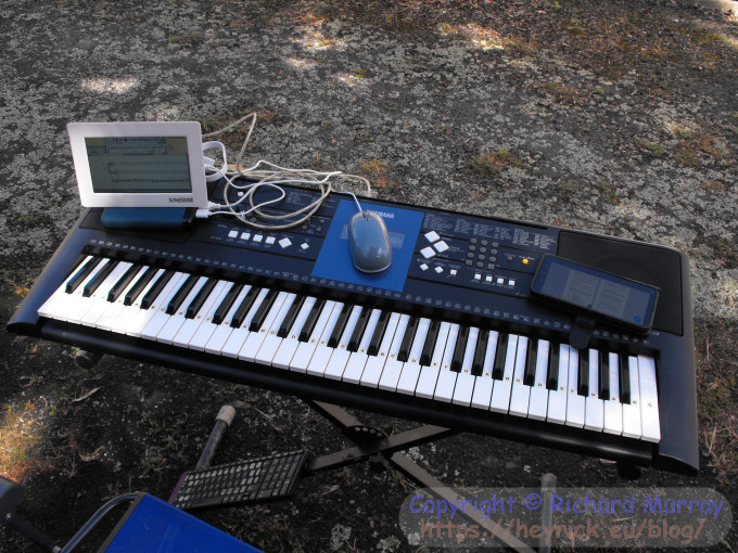
Playing with Rhapsody
Saturday morning, I sat outside playing with Rhapsody and my keyboard. It was... torturous. Not because of any inherent problem with the software, other than a lack of familiarity, but because the Pi 1 only has two USB ports, so I had the mouse and the music keyboard hooked up. But no typing keyboard. Which made things rather difficult.
Making music.
One of the really useful things about Rhapsody is that I can play phrases to myself, to experiment and see what I think sounds nice, and then switch on Capture to be able to input the music that I'm playing into a score.
Perhaps as my familiarity with both this software and correlating notes on the keyboard to notation increases, this will become a lot simpler, but something that I found a big block was the transposition between "something I can play" and reproducing it in a music editor. Let's say that my past efforts have only sort-of matched what I had in mind, but time and patience prevented me from fiddling until it was correct. I have, in the past, used MuseScore on my XP box, but it was a powerful and capable notation package (along the lines of Sibelius) so the learning curve was steep. Inputting music from a keyboard, especially when you're not even good enough to pretend to be a novice, was more trouble than it was worth. In the end, I was just dropping notes into the score, hitting Play, and altering them if it wasn't right. It... wasn't ever right.
Rhapsody usefully has three capture methods. The first, that I'm using, is a straight transcription of the notes being played. This is useful as I suck at playing the keyboard, so I can just press the notes in order without worrying about timing. It looks like it might alter the note style depending on press length, but I'm not using that at the moment.
The second method is semi-timed in that the software will output a metronome tick and pressing keys will result in notation appearing, timed to fit the beat. Sort of. In my brief experiments it seemed to play back faster, but there's probably some tempo setting I've not found.
The third method does not show anything on the screen. It will buffer all the notes played and then use a lot of clever logic in order to transcribe that to notation after the piece has been played. This is for experienced musicians, which I'm not.
Suffice to say, I think I might get some benefit from Rhapsody once I'm a little more familiar with the product and have switched the Pi 1 for the old Pi 2. I did buy a smallish (8GB?) µSD card, but I have no idea where I put it.
Sadly, while the executable version of Rhapsody 4 has been released as a free download - you can get a copy and a scan of the manual from https://jeanmichelb.riscos.fr/Rhapsody4.html - it seems as if the source code is no longer. Which precludes further development except for those willing to delve into crunched BASIC.
But, not to complain. It's a capable product and is quite happy working with it's own filetype and/or MIDI files.
The only thing I will warn you is that if you have weird issues with a MIDI keyboard, like not playing anything or playing the keyboard does nothing in capture mode... you'll need to fiddle around with the MIDI settings (it's a file inside the app). Different keyboards output on different channels, so I'd suggest setting numerous ports to accept input on all channels (except channel #10 which is usually reserved as the percussion channel, see the setup docs for more info).
When I first tried Rhapsody, playing music was no problem, but I couldn't input anything. I switched the default setting (Roland SC55?) to GM (General MIDI) and then it worked.
Eagle-eyed people might have noticed that my composition, currently only the bass line played on plucked bass, is running to 6:4 time with accent on the first beat and staccato on the sixth. Clearly the nice simple common time (4:4) doesn't work with my brain. Hmmm...
I don't want to toot my own horn as I'm no egoist, but it's my MIDI module, along with some brilliant revisions and enhancements by Dave Higton, that makes this work. I made a release earlier this month, pick it up if you need it. Just pop it into $.!Boot.Resources.!System.500.Modules, then plug in your keyboard and load Rhapsody, and it'll "just work". ☺
RISCOS.fr
Jean-Michel has done a good thing in sorting out bringing Rhapsody4 to the world and scanning the user guide.
Note, also, that David is still offering licences of the ABC compiler to willing programmers, and that now ABC is able to make use of VFP so - rather annoyingly - it is quite possible that compiled BASIC that makes a lot of use of floating point maths may kick compiled C out of the room; as even though the Norcroft compiler is competent (way more than ABC) and has a lot of optimisations it can perform, it is still, even in 2022, hobbled by using FPA opcodes for the floats and doubles. These are emulated, and are literally hundreds of times slower than the equivalent VFP code.
The Frenchies have some interesting things going on.
Please do remember this and show your gratitude when it comes to the RISC OS Awards - Best foreign language resource...
A pleasant drive and a vide grenier
After the post was delivered (just a newspaper), I went to https://vide-greniers.org/ to see if anything was happening tomorrow (which is today, as I'm writing this on Sunday).
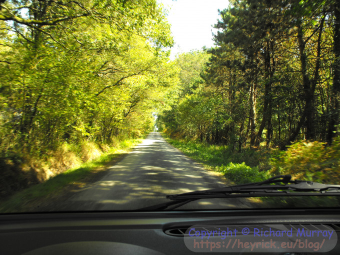
Nothing on Sunday, but there was a vide grenier in a place called Le Pertre which was... I dunno, forty or fifty kilometres away. I wasn't paying attention. Within ten minutes I was sitting in Caoimhe and setting up Google's navigation to tell me the best way to get there. Be on my way before I think of excuses why not to bother. ☺
I had planned on seeing if I could drive to Terra Botanica this holiday. It's just north of Angers, which is about 85km. It'll take me about two hours.
However, given what the heatwave did around here, I didn't think that it was necessarily good to head all that distance. I think it might actually be better in May/June when more things will be in flower? Maybe next year.
Mom and I were planning to go there, I had even sorted out the possibility of year tickets as I think it's something she'd have liked to visit in different seasons. But, you know, reality bites.
Asides from two visits to Big Town, once to Craon, and a couple of times to the local supermarket, I stayed at home.
As for all the things I planned to do on my holiday? I did... none of them. I did a bunch of different things instead. Like painting and reputtying the front window? That was triggered by spotting an inexpensive can of white wood paint in Action and thinking "hmmm", and the putty was because, well, it needed it.
Scraping the moss off the driveway? When it was pushing mid thirties? That certainly wasn't planned, but even I got fed up of sitting inside doing nothing because of the heat.
Okay, it wasn't nothing, various entries on my blog and videos on YouTube attest to that, but I think a lot more might have happened if it wasn't so hot for the first two weeks. I might have taken even more domestic appliances apart! ☺
Lots of scenery.
The route was cross-country and it was the second time that I have been for a drive that I enjoyed driving. The second time since November 2019.
The first time was July last year.
I had nowhere specific I was going (yes, I was heading to a vide grenier but if I got sidetracked, no big deal) and I had no time I had to be there. So I could turn up Sara Taylor ("Chibi", not the cricketer) and just enjoy the pretty scenery.
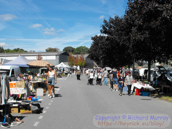
The vide grenier, advertised as "up to 200" was not even half of that. I walked around in around ten minutes. There was nothing of interest. I didn't notice much being bought either. All the good stuff probably went at 6am...
The vide grenier.
As you can see, I took my new camera and it came into it's own when composing shots with the aid of optical zoom. This is not full zoom, it's just going in for a better photo.
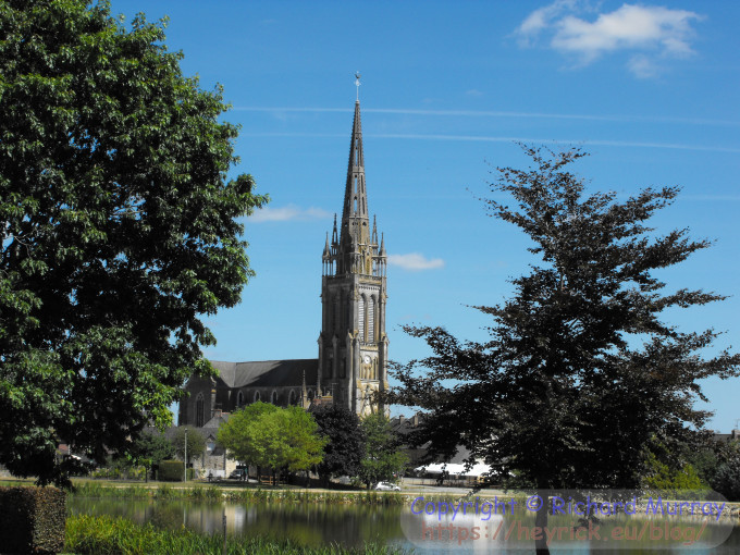
The church at Le Pertre.
You can't see it in the scaled-for-blog version, but the full size photo is clear enough that it is possible to expand the image to read that it's 2.55pm on the clock.
I took a different route to come home, stopping at a supermarket to pick up something for a late lunch. I don't eat breakfast when I'm not at work. I apologise to those who enjoy a Full English Breakfast, but I can't think of anything other than lack of sleep that would mess me up more. That sort of grease first thing in the morning, oh my.
On work days, I need energy, so it's a bowl of Frosties and at least two large cups of tea.
I got... some things.
Lunch!
I guess by 4pm I was a bit hungry. Oh, and you might spot a trend in what I chose. ☺
Widescreen versus photo frame
I had an email from somebody saying that they preferred the photo frame images as taken with the new camera.
I can understand that they may look better on the blog because the image uploader rescales whatever I upload to a fixed 680 pixel width (if >680px), but from the point of view of a photographer, what is actually being recorded is less, not more.
Here is a copy of the above photo, with a big magenta square showing what my camera would photograph.
Widescreen vs photo size.
Yes, sure, I could capture everything by just moving backwards a little, but then there's a lot of unnecessary rubbish at the top and bottom of the frame. You can see this in the vide grenier photo above, where the road close to the camera and a lot of the sky are unnecessary to the layout of the photo.
When I compose my photos, I compose for widescreen. I'm not throwing away picture information, I'm adding more to the sides. And with my new camera and it's wider (20:9?) ratio, it allows for even more, though I do still tend to aim for 16:9 ratio as that's what I'm most used to.
That isn't to say that a full frame isn't useful. I think the photo of the church looks lovely, the focal point is the church, which by its nature is a tall structure, so the composition of that shot allows it to be shown without having too much extraneous clutter at the sides.
The reason that the widescreen images don't look as good on my blog is because of the fit-to-width resizing. Trust me, if I scaled everything to a specific height rather than width, the full frame shots would suffer badly. But it's a width fit as computer screens are wider than they are tall (most are 16:9 these days).
Additionally, us humans see more horizontally than vertically. If you turn and gaze intently at something fixed, like a lightswitch, you'll notice that you can notice more to the sides than up and down. Our eyes have a field of view of around 140° in all directions (you'll find everything from 45° to 160° quoted on the internet, but it depends upon what you consider useful vision; you'll note that the further away you are from the centre point, the blurrier things become), but since we have binocular vision with eyeballs slightly offset horizontally, we're able to see more across our field of vision than up and down.
In evolutionary terms, we never had to dive for cover from Pterodactyls, so what's going on above is nowhere near as important as what could be going on to the sides.
Which is a longwinded way of saying, we see in widescreen. ☺
More on the Fujifilm S1000fd
There are five things that I use to determine the usefulness of a digital camera.
1. Focus accuracy
When you are taking photos in automatic mode, the implication is either that you either don't want to fiddle with lots of settings, or that maybe you don't have time, it's a point-focus-capture moment.
Here, the S1000fd is a bit middle-of-the-road. It rapidly whips through the available focus choices, stopping when it reaches a point that's clear and in focus. However I suspect it does this by detecting when the image is sharpest, and if there's a lot of contrast in the scene it'll often get this wrong.
Note that the advanced modes offer various styles of focus, I'm concentrating here on the automatic centre-focus.
2. Colour rendition
The second thing I look at is colour rendition. Colours must be "lifelike". This is suprisingly easy to get wrong. My cheap tablets and the ESP32-CAM (that probably use a similar generation of 2mpix imager) offer horribly washed-out looking colours. Conversely a lot of mobile phones these days tend to have too much colour saturation, particularly the reds or the greens.
As can be seen from the photos I've shown so far, the colour rendition is pretty good.
A night lurker.
The above photo was lit using an LED torch to avoid firing the flash into its eyes. As you can see, even in such conditions, the white balance has adjusted itself to give good colours.
3. Image quality
Something that is very important is image quality. This is primarily concerned with two things. The first is how visible the grain is. Now all cameras will have some degree of grain because the image is comprised of millions of image sensors, all of which will have tiny differences in how they perceive light. Plus, in the case of a CCD, it's actually an analogue device. Normally this is a good thing, as having areas of flat colour would look a bit unnatural.
However, this only works so long as the grain is not obvious. And it doesn't tend to be in normal daylight photohraphy. It's only when the bright lights start to fade that grain makes more of an appearance, it's starting to appear here, but the blog scaling has mostly smoothed it out. ☺
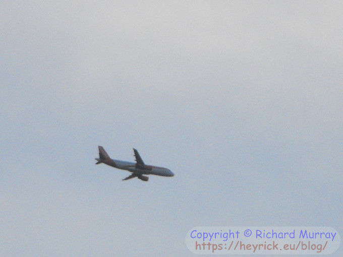
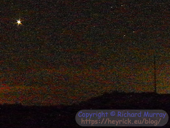
An easyJet just after sunset.
These planes usually fly over at 6,000-8,000ft (according to FlightRadar24). It was also about three kilometres away. This was 12× optical zoom, with a touch of digital zoom, so maybe around 25× in total? I'm kind of impressed that with all of these factors in play, I can read easyJet on the tail.
The flight, I think, was Geneva to Rennes.
Typically higher shutter speeds and low light conditions emphasise the visibility of grain.
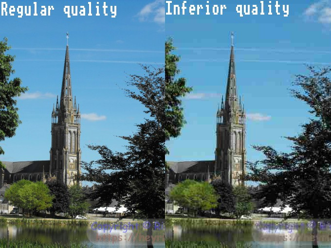
The second part of image quality is artefacts introduced into the image due to the JPEG compression. If there's a choice between "standard" and "fine", you should pick fine. On this camera, the quoted average filesize is ~2.5MB for a full size standard image, and ~4.9NB for a fine image. Obviously this will depend upon the image content, but an average that's a little under twice the size means a lot more clarity and detail.
Here is a faked copy of the church in normal quality and low quality side by side. Normally the loss of quality isn't quite this dramatic... at least, not until you zoom into the details.
Quality examples.
4. Flexibility
A good camera will be two things. It will be an automatic point-and-click for when taking photos of reality is the important thing. And it will offer all sorts of ways to tweak behaviour when you feel like being a little more creative.
In this respect, the camera on my old Samsung S5 Mini was terrible. As it was the 'mini' version of the phone, they did away with the manual controls for some reason.
Granted, on my phones I don't have much need to go into the Pro/Manual modes because the automatic ones are so good, however when you need control, there's simply no alternative.
For example, pushing the shutter speed and/or light sensitivity in order to take a photograph of a person standing in front of a window. This will typically give a badly underexposed face because of the light from behind.
Taking pictures of black people. It's not racist, lighting and exposure of people with black skin is entirely different to people with white skin. This is why so many facial detection systems in use by police forces seem to have racial bias - it's because of this. If you are dumb enough to tailor your cameras and AI for white people, it'll probably think most black people look alike because it'll fail to accurately capture the subtle differences. Aside: At work we have several automatic doors that are triggered by putting a hand to a sensor that uses a red LED. White people and our white uniforms trigger them. It's a bit 50-50 if a blue latex glove will, and if the glove doesn't, neither will a black person.
Taking pictures of food under fluorescent lights when the white balance has a nervous breakdown and gives everything a sickly green or yellow hue.
Having control over everything is icing on the cake, but at the very least you need to be able to drop out of automatic to adjust the shutter speed (1/50, 1/25, etc), the sensitivity (ISO 200, 400, etc), the white balance, and maybe some other things like focus, and flash intensity, etc.
Typically, a lower end digital camera will either offer a set of preset white balance settings like sun, cloud, incandescent, etc or it will offer those along with a custom setting. Typically the custom setting will be automatic, you take a photo of something white under the lighting conditions, and the white balance will adjust itself to that (which can lend itself to some measure of creativity if you take a photo of something, say, Hello Kitty pink or vivid blue).
Colonising Mars, or playing with the white balance?
The above photo was done by simply pointing the camera at a bright blue piece of plastic and telling it "this is white". The irony, of course, is that when severe Saharan dust storms whip up into Europe, the sky can be like this naturally!
On a smartphone with a touch UI, white balance may instead be a slider to set the colour temperature.
5. Night photography
It is completely unfair to compare anything from before around 2016 with modern cameras. Modern smartphone cameras can produce amazing night photography thanks to having such technologies as pixel binning (merging smaller pixels to enhance low light capabilities) and having larger pixels to allow better light capture.
This camera, as is typical of its generation, performs fairly poorly with night shots. It may be able to take reasonable night party shots without too much blur. I wouldn't know, I don't go to parties.
But, really, anything with an exposure over a tenth of a second would need a tripod. So that's everything without flash.
The longest exposure on this camera is eight seconds. A tripod is essential.
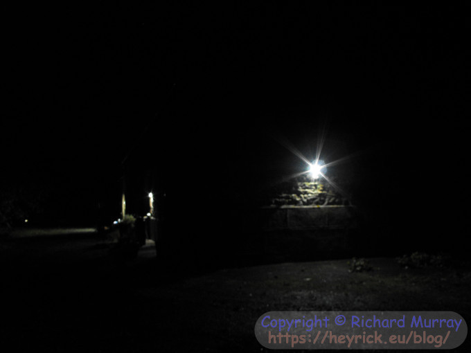
Here is a fully automatic photo of the side of the house, with the automatic solar lights triggered.
A night shot.
It's worth noting that none of this is in focus. I think the automatic focus gave up and reverted to a default "look at the stars" setting.
Knowing what my phone can do, this would be embarrassing if we didn't make exceptions for the age of the camera.
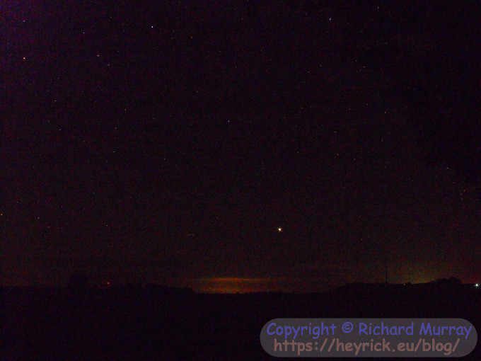
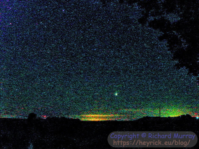
This is looking east towards Jupiter with the camera set to ISO 1600 and an 8 second exposure. You can see a reddish-purple hue and a fair amount of noise in the image. This could perhaps be tidied a little in post, but there's only so much that can be done here.
Jupiter, ISO 1600.
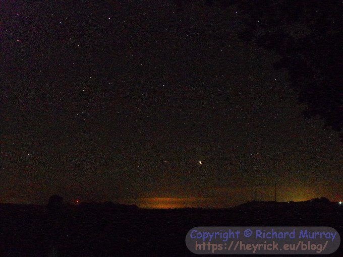
It is possible to push up to ISO 3200, though the resolution drops to 3 megapixels, so it's possible it is using it's own form of pixel binning.
Jupiter, ISO 3200.
Much more noise, and interestingly it took as long to process the image as the initial exposure.
You can also see a purple bloom at the upper left of the image. This is fairly typical on CCD sensors in these conditions. It's an artefact of the technology itself (you'd see the same thing if taking an equivalent picture whilst holding the lens cap over the lens).
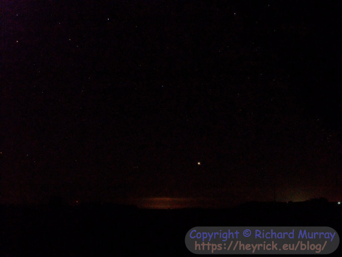
This is the first of the Jupiter photos after a bit of fiddling using the Google Photos app. It's better, although you'd really need something more capable to perform channel-based modifications (as much of the noise is in the reds) as well as selective regions to get rid of the purple at the top left.
Jupiter, tweaked.
The second, noisier, photo isn't really recoverable. So the provision of an ISO 3200 mode seems more "because they could" rather than anything actually useful.
Now, you're probably wondering what the big deal is. Okay, it's slightly noisier but it's not that bad, right?
Well, you're looking at the scaled blog versions. Here's a snippet of the ISO 3200 picture at real size to show what we're actually dealing with.
Jupiter and The Noise.
That being said, you could use the noise as stylistic suck and turn it into a feature.
Jupiter, pushed like metal pushes guitars.
Of course, there's an interesting philosophical question in that if the universe is filled with billions of stars, why doesn't the night sky look like that?
The answer covers red shift, the age of the universe, and the speed of light. But the fact that you can look up and see gaps between the stars is all you need to begin an epic quest through the heart of science.
S1000fd display technology
There are two displays in the digital camera.
The first is a big 2.7" LCD on the rear of the camera. That's about 55mm by 44mm at a 4:3 aspect ratio. With 230,000 dots. Notice that I say dots, and not pixels. That is because it's a clever cheat as each pixel is three dots (one red, one green, one blue). This means that effectively the screen has 76,000 pixels.
The display is therefore likely something in the region of 320×240 resolution. I think the actual resolution is likely less horizontally and more vertically as I think the pixels are horizontal rectangles due to having three side by side.
Anyway, assuming this is correct, it means there's something like six pixels per millimetre. It's enough that it can be used to see what the camera is seeing, just so long as you don't look too closely.
LCD on camera back.
I do not recommend that you use this too much. In one day, I took about 120 photos and had the screen on a fair bit, and, well, I burned through a set of batteries in no time.
The viewfinder LCD is, actually, a much more interesting device. With a size of 0.2" (that's something like 5mm × 3mm), it squeezes in 200,000 dots to make a remarkably high resolution display in a tiny size.
FLCD viewfinder.
It's hard to get a good photo of this, as it passes through a lens aimed at making a good impression on a human eyeball.
Now, you might be saying "hang on, if it's only 200,000 dots, that's worse right?".
It's a logical assumption, until you understand that it is actually a monochrome LCD. The way it actually works is that it is an extremely high speed LCD (not like the ones in computer screens that run at 60Hz refresh because they have a response time of around 16ms, which means that if your monitor has a ~16ms response, it doesn't matter if you feed it 60Hz, 75Hz, or 85Hz input signals, the panel itself will be running at 60Hz. It physically cannot do any better (modern gaming screens run in the order of 1-4ms response for much higher frequency refreshes).
What FLCD does is it has a response time of around 3ms (or around 1/360th of a second, so the display pixels can be switched in 3ms, and then the backlight illuminated for 3ms, to make a 6ms output (or 1/180th of a second).
This is performed with a red backlight, then with a green backlight, and finally with a blue backlight. The three colours in turn add up to 1/60th of a second.
So instead of having three dots, one for each colour, it has a set of monochrome dots and changes the actual backlight colour extremely rapidly to produce a higher resolution display than the rear LCD.
The pixels are more visible, but this is because the optics try to scale up the LCD to be something that you look at closely. If you looked at the rear LCD in the same way, it would look awful with about a third of the effective resolution. If you flick your eyeball rapidly, you can just about make out red and green ghosting as your eye moves. But it's nothing like looking at a CIS scanner as is found in most domestic multifunction printers. You actually need to be paying attention to notice the effect.
The quality is good enough that the maxi-thumbnail view offers ten photos across the screen, and nine down, and the thing that affects usability is the time it takes to create the display, not the display itself.
Internally, the camera is powered by a Zoran COACH 10S (S = entry level) processor. The two page publicity sheet talks about dual CPUs, 720p H.264 compression, and CD quality audio; but there's no datasheet that I could find for the 10S (part #ZR36483BGCF) so I don't know what the actual specs are. Certainly, the real capabilities are "much slower" and "can just about manage 480p MJPEG".
The device itself runs from a 12MHz crystal.
The imager is a Sony ICX675 which is a 7.705mm diagonal 10 megapixel CCD with 1.68µm square pixels with larger photodiodes and microlenses and reduced smear (compared to earlier devices); and a saturation of 465mV (160mV typical). Running at 38MHz, it can read out 1.96 full frames per second, or in a 4/12 line mode it can output VGA at 30fps (but it's 460 effective lines, not 480!).
There are no on-camera diagnostics or hidden setup menus. These were supplied as a special software package on an xD card. Since an XD card is basically a NAND flash chip in an expensive container, it likely appears to the processor as a bit of Flash and if the "menu" and "firmware.bin" files from a special archive are present, they will be used instead of the regular UI to allow access to all sorts of setup procedures.
The zip file "ZJ01169-100.zip" only seems to exist on a Russian website aimed at Fuji cameras, but you need to register to see anything and, well, there's only so far Google Translate will take you...
How do I know all of this? The camera is old enough that the Fujifilm confidential service manual is available.
Back to work tomorrow
It's raining outside.
Even the sky is crying.
That's all I need to say...
Okay. Between this and eating and going for a short walk to stretch my back, I've taken up seven hours. So time to upload this, grab a yoghurt, and go sit on my bed and see what's new on Netflix, but probably end up watching FailArmy on YouTube...
Your comments:
Please note that while I check this page every so often, I am not able to control what users write; therefore I disclaim all liability for unpleasant and/or infringing and/or defamatory material. Undesired content will be removed as soon as it is noticed. By leaving a comment, you agree not to post material that is illegal or in bad taste, and you should be aware that the time and your IP address are both recorded, should it be necessary to find out who you are. Oh, and don't bother trying to inline HTML. I'm not that stupid! ☺ As of February 2025, commenting is no longer available to UK residents, following the implementation of the vague and overly broad Online Safety Act. You must tick the box below to verify that you are not a UK resident, and you expressly agree if you are in fact a UK resident that you will indemnify me (Richard Murray), as well as the person maintaining my site (Rob O'Donnell), the hosting providers, and so on. It's a shitty law, complain to your MP. It's not that I don't want to hear from my British friends, it's because your country makes stupid laws.
You can now follow comment additions with the comment RSS feed. This is distinct from the b.log RSS feed, so you can subscribe to one or both as you wish.
Zerosquare, 21st August 2022, 21:09
> I had the mouse and the music keyboard hooked up. But no typing keyboard. Which made things rather difficult.
You need to write a piece of software to map MIDI key on/off events to keyboard make/break codes :)
Rob, 21st August 2022, 22:44
..or investigate USB hubs ..
VinceH, 24th August 2022, 00:36
Reading this (and seeing the picture), I've finally cottoned on to what a vide grenier is - it's the equivalent in France of a car boot sale (aka an 'jumble sale but outside') here.
You may have explained this at some point in these pages, in which case either it's one I've missed, or I've simply forgotten.
I haven't been to a boot sale in years. Many of my Star Trek, Doctor Who, etc annuals came from them. I have a box file here somewhere of 2000AD comics that I picked up for a quid or so (fairly late 80s IIRC, so nothing spectacular).
Coincidentally, i've just listed my annuals in a spreadsheet, ahead of a database.
Anony Mouse, 2nd September 2022, 00:28
Some years ago I did some audio overdubs using CoolEdit (now maintained by Adobe and called Audition). Using Logic Pro on a Mac more recently was something of a culture shock. All the MIDI instruments are now done in software using VST plug-ins and you can have up to 128 tracks, either MIDI or audio. It's pretty awesome.
Now, cameras. If anyone has ever used any of Canon's EOS Digital range, particularly the semi-pro models, well, this is what a digital camera should be like. I have an older EOS-20D (the semi-pro model from around 2004) which 'only' has an 8Mpx sensor and lacks some of the features of the newer 7DmkII onwards (wi-fi connectivity, Speedlite flash sync transmitter etc) but the photos it produces are still mind-blowing. Canon's EOS lenses are superb, and this has far more impact on the picture quality.
This web page is licenced for your personal, private, non-commercial use only. No automated processing by advertising systems is permitted.
RIPA notice: No consent is given for interception of page transmission.