It is the 1729th of March 2020 (aka the 23rd of November 2024)
You are 3.147.75.46,
pleased to meet you!
mailto:blog-at-heyrick-dot-eu
Other people's code - Ovation and rummaging around inside it
Unless you've been living with your head under a rock, or this is your very first time here, you'll be aware that I have taken on "modernising" Ovation. I do not plan to do a lot with Ovation because if people want all sorts of fancy things, they ought to purchase OvationPro (which is also available for Windows).
However...
...the temptation to fiddle... ☺
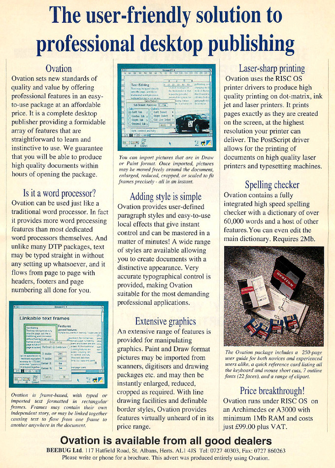
From the July 1991 issue of Acorn User:
At the time, the typical price for Ovation was £79, priced to compete with Impression Junior (except from Beebug themselves who seemed to list it at £99?). The full version of Impression II that most people compare it with is almost twice the price - £139 (or an astonishing £198,57 in Computer Concepts' own advert!). So while Ovation is aiming at the budget end of the DTP market, it offered more than it's fair share of features.
Let's compare, shall we?
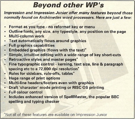
A snapshot from an Impression advert in the July 1991 issue of Acorn User. I'm not even going to comment on the possessive apostrophe...oh, whoops.
Format as you type - no reformat key or menu
Ovation does this. It also has a holdoff delay so that you can do productive work on an 8MHz processor (as the original Archimedes range was) without incessant reflowing. You may notice if you move large images around that Ovation "catches up" a few seconds later.
Outline fonts, any size, any typestyle, any position on the page
Somewhat essential for DTP work, one might say...
Multi-column work
This can be either defined when a new document is created, with the desired number of columns automatically set up; or the columns can be created on the fly either in the main document or in a master page. Ovation also supports the concept of "chapters" so that different chapters can have different master pages (and, hence, different layouts).
Text automatically flows around graphics
Demonstrated to the point of abuse a week ago.
Full graphics capabilities
Ovation too. It started with support for Sprites and DrawFiles; later on support for ArtWorks and JPEGs as these became available.
Embedded graphics (flows with the text)*
Okay, this one didn't arrive until OvationPro; but note the star - Impression Junior doesn't do it either.
Simple, intuitive editing with a wide range of key short-cuts
Ovation uses David's own custom keyboard bodger module to allow the software to access a range of keypresses that are difficult to directly detect within the Wimp (more on this below). Ovation came with a handy card listing all of the keypresses and menus.
Retroactive styles and master pages*
What is a retroactive style? One that takes effect globally? Ovation does that. Master pages too. And chapter master pages. But note, there's that star suffix again.
Fine typographic control - kerning, text size, line & paragraph spacing etc to a 72,000 dpi resolution*
Yup. Kerning, tracking, text size, leading, line spacing, space before/after, blah blah. I've often abused these in Frobnicate (especially leading) when I needed an extra line or two at the end of an article. I'm not sure if it goes to 72,000 dpi. I have ems, pt, %, etc depending on what we're talking about. Note there's that star again. Gotta save the good features for the expensive version!
Rules for sidebars, rule-offs, tables*
Not actually sure what this means (though, note the star). If it is rules, Ovation has them. And draggable guidelines that things can 'snap to'. There are also tabs (left, right, center, decimal) and indentation (left, right, 1st line).
Huge range of print options
Unquantifiable - what is "huge"? Ovation allows all or specific page ranges to be printed, all/even/odd pages, collated, reverse order (useful for a paper tray that places the pagers face up, so you can print backwards and it'll be in the right order when it is done), pause between pages (for older printers with manual feeding or more complicated work for printing both sides with a domestic inkjet), with or without pictures, and a mail merge function - something that comes as a part of the extra Business Supplement to Impression (at fifty quid, costing nearly as much again as Ovation).
Multi-line headers/footers even with graphics
Ovation offers headers and footers. These are "just frames" in the master page, and as such can contain anything that is put into a frame including pictures. Ovation also support the idea of "facing pages" so you can have different left and right layouts (so, for example, the page number will always be on the 'outside' of a page).
Draft 'character' mode printing or RISC OS printing
Ovation doesn't support this, but it does support quick draft printing (of the real thing) so you can check that it looks correct before tying up a machine for ages rendering the images to a LaserJet (remember, an 8MHz machine talking to a LaserJet II via parallel port is not fast!).
Full colour control
Ovation supports colour in fonts and backgrounds and such. It is a fairly basic R G B selector (you need OvationPro if you want Pantone palettes and CYMK), but it is sufficient to add colour to documents. And, of course, graphics objects are in colour...
Includes enhanced version of SpellMaster, the popular BBC spelling and typing checker
Ovation comes with a spelling checker version (requires a 2MiB machine) and a sixty seven thousand word dictionary, plus the ability to add and edit dictionaries.
'Not all of these features are available on Impression Junior
Need I say more?
So, you can have a basic version of Impression, Impression Junior, that likely doesn't do as much as Ovation did for the same price; or you can have the full version of Impression II that does more (and the Business Supplement to do even more) for... what does it come out to be? Two hundred and fifty at CC's prices? That's three times more expensive than Ovation. Maybe even getting into Site Licence pricing. It's just a shame that Beebug / RISC Developments made a bit of a hash out of promoting Ovation.
David himself says "Impression is an excellent program - although I seem to have spent my career trying to beat it" and the sad thing is that while Impression is excellent and has many people who swear by it, Ovation is a perfectly acceptable alternative. Okay, it doesn't deal with colour separations and the like, but these omissions were resolved with the more powerful OvationPro, which has certainly one-upped Impression by being not only 32 bit native (something Impression-X still has not managed) but also by being cross-platform (something no version of Impression will ever manage). Ovation came in at the budget end of the market with a two-digit price tag and delivered results more in line with the professional end of the market.
Now to turn attention to the code.
Looking at other people's code can be an unsettling experience. Not that it is good or bad, but more that anybody who has been coding for a while will have preferred ways of doing things and other ideas will be jarring. One of the greatest variations of C style code is where to put the braces.
As far as I am concerned, this is correct:
      if (something == somethingelse)
      {
         dowhatever();
      }
and this is horrible:
      if (something == somethingelse) {
         dowhatever; }
and people who do this should be banned from writing code:
      if (something == somethingelse) {
      dowhatever; }
There is also the choice if indentation - which varies from one space to eight spaces (or a Tab) per indentation level, and may encompass the "when I feel like it" method, where the indentation varies depending on the whim of the author.
Are variables initialised? Is everything placed in header files? How is it built? And so on.
Happily, the Ovation code uses sane brace placement. It is a bit peculiar with regards indentation levels, but we must forgive this as it is worth noting that the copyright lines at the top of the text files say 1988. It is entirely possible that the program was written in something like !Edit on a crap-resolution (by today's standards) monitor. The images that I process for my blog are sized to be no wider than 680 pixels. That's about 40 pixels more than basic 640 pixel screen width which is what got us by for a long long time, whether TV style mode 12 (640×256) or hi-res mode 20 (640×512) or the later VGA-like mode 27 (640×480). This all equates to 80 characters across the screen, or around 76 visible once you account for scroll bars in !Edit.
The age of the software also explains the interesting "do it myself" approach to application writing. There are a few bits and pieces lifted from RISC_OSLib here and there, but no library is used other than CLib. This is because back then RISC_OSLib was contradictory, buggy, endlessly peculiar, and included a lot of junk in each part of the library (so could easily be inefficient); and while some blessed people were able to get some of the source code from Acorn, other people couldn't and it quickly became clear to many that Acorn had practically zero interest in fixing things. It is no surprise that a selection of more user friendly libraries appeared (DeskLib and OSLib to name two). However, Ovation predates those. I found RISC_OSLib to be execrable, which is why I use DeskLib in my own programs, and I can't say I'm surprised that David shunned it.
If you think I'm being rude to Acorn's library - read this. Or Google for a suitable phrase, such as "risc_oslib horrible"...
I have not yet had time to get to the bottom of David's keyboard handling. It is aided by a stand-alone module for dealing with potentially contradictory key codes. Why? Well, Acorn decided that the return to Wimp_Poll should deal with non-printable keys by using codes from &180 upwards. This allows the F keys, cursors, etc to be handled in normal, shifted, controlled, and control-shifted variations. It looks like the highest defined keypress is &1FC (Ctrl-Sh-F12), so could somebody please explain to me why Page Down is &19E and Page Up is &19F; which are exactly the same as Shift-Down (&19E) and Shift-Up (&19F)? This is repeated for Ctrl-Page Down (&1BE) / Up (&1BF) and Ctrl-Sh-Down / Up. Using a basic Wimp_Poll routine, you simply cannot distinguish between (Ctrl)Page Down and (Ctrl)Shift Down. Ditto for up. This is rather important if you have some software that wants to provide different behaviour in each case. Ovation, for example, uses Ctrl-Sh-Up/Down to act like a Page Up/Down where the top of the next/previous page is at the top each time; in other words it steps page by page. Page Up/Down goes up and down by how much is visible on the screen; in other words it steps screenful by screenful. Similar, but not identical.
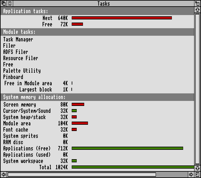
Remember, also, aside from the spelling checker version (which requires 176KiB to cache the dictionary, in addition to overheads of having the spellcheck code present in the first place, the software was originally intended to be functional on a 1MiB machine. To give you an idea of what I mean, here are the memory allocations of a 1MiB RISC OS 3 machine booted as-is (no extensions at all):
I have managed to use Ovation on a machine of that specification. It was painful - the tiny Font cache means redraws are slow, disc swapping is necessary, and using Ovation with !Printers is a tragi-comedy at times; but it worked. It was feasible to do basic DTP on a 1MiB machine. And, yes, it did used to look like that.
When I moved to a 4MiB 25MHz A5000 with multisync monitor, that's when DTP came into its own. The result? Well, need I mention Frobnicate again? I also did a local newsletter for a while, an entire ISO 9001 quality manual (but the boss preferred WordPerfect 5.1 for some reason), plus advertising copy for an estate agency which was transferred from print dump to magazine page. They took a Laserjet dump of the content and pasted in photo scans afterwards. I don't know why I couldn't send the data as PostScript? That wasn't my call...
Unfortunately the boss of the company considered my A3000 to be a "toy" (I think he frequently mistook it for an Amiga) despite the fact that it could run runs around WordPerfect or, god help us, his favourite - XyWrite II. Oh well.
Now I have written in the past that RISC OS' support for unicode is lamentable. So instead I'm going to describe how supporting it in Ovation was done. First of all, this is little more than a hack. An instantiation of Ovation either runs (entirely) in UTF-8 mode, or it does not. There's currently no middle ground. Furthermore, the files are identical in either case. The difference is how the file contents are interpreted.
The first step is to decide if we should or can enable UTF-8 mode. In c.main, the following function was created and called prior to Ovation starting itself up:
void check_for_utf8_hack(void)
{
   // ##RICK## Checks to see if right ALT is held as program starts.
   // If so, tests if we can go into UTF8 mode.

   os_error * err = NULL;
   os_regset rx;


   rx.r[0] = 129; // scan for a particular key
   rx.r[1] = 247; // right Alt
   rx.r[2] = 255;
   os_swix(0x6 /* OS_Byte */, &rx);

   if (rx.r[1] == 255)
   {
      // Key is pressed.
      // Attempt to access a UTF8 font (won't work if no UTF8 support).
      rx.r[1] = (int)"Homerton.Medium\\EUTF8";
      rx.r[2] = (16 * 16);
      rx.r[3] = (16 * 16);
      rx.r[4] = 0;
      rx.r[5] = 0;
      err = os_swix(0x40081 /* Font_FindFont */, &rx);
      if (err == NULL)
      {
         os_swix(0x40082 /* Font_LoseFont */, &rx);
         utf8hack = TRUE;
      }
   }

   return;
}
What we are doing is a quick test to see if the Right Alt key is held down. If it is (the OS_Byte SWI returning 255 to denote this), then there are all sorts of tests to determine if the Font Manager is capable of handling UTF-8, but none so simple as just attempting to get a handle to a UTF-8 font. If this succeeds, we know the machine is capable, so we discard the font handle and flag that "utf8hack" is in force.
An omission, on my part, and something I'll fix soon, is that the hack does not look to see if the machine is actually in UTF-8 mode already. This is a minor issue, however, as using the UTF-8 "alphabet" affects the entirety of RISC OS globally. What is happening here with Ovation is providing it with the ability to use Unicode when RISC OS itself is sat in Latin1 (or whatever). Because I really do not envisage a Unicode compliant Wimp that is also capable of correctly catering for older software. Perhaps because RISC OS is traditionally Anglocentric that numerous internationalisation features didn't even work correctly (or were not provided or partially provided) prior to RISC OS 5. Even now, how does one sensibly use European timezones and have the time switch to and from summer time automatically? Indeed, the whole Territory system is a great example of a good idea wrapped up in a terrible implementation. It's a catch 22. RISC OS didn't fare strongly in the Far East, so apart from a supposed few IMEs for Japanese and Korean (the source code of which doesn't appear to exist?), the support for these languages is minimal. And since the support is minimal, natives of said countries may be less inclined to consider RISC OS. After all, one cannot simply switch to the UTF-8 alphabet and translate various RISC OS messages to Japanese (Chinese, etc etc) because Edit makes a complete mess of displaying and editing UTF-8.
The next step is to then alter Ovation to load and use UTF-8 fonts. As it happens, all font definitions are loaded through the function font_find() within c.wz. As such, it was possible to amend the function to append "\EUTF8" (the \E meaning that an encoding type follows, and UTF8 being the encoding name).
Basically, I inserted this:
   // ##RICK## Optional hack to force fonts to be opened in UTF8 character set.
   if ( utf8hack )
   {
      strcpy(string,name);
      name=string;
      strcat(string,"\\EUTF8");
   }
That was it. The Font Manager would spot the Unicode characters and render them appropriately. There was no need to mess around with the text flow or anything as Ovation asks the Font Manager for details of how big characters are and where things are to be placed. UTF-8 or not, the Font Manager replies accordingly.
The next step in the puzzle is an important one too. Something that is really really annoying is when you are using a multibyte character and you need to press the cursor left or right multiple times to step from one character to the next (as it assumes one byte is one character).
Luckily for me, Ovation embeds markup codes into the text and contains routines to skip over these when moving the cursor. So what was necessary to handle moving the cursor along the line of text was to teach this routine (nextcharlen() in c.vec) about UTF-8.
Even better, the way moving the cursor backwards is handled is to scan along the current line of text from the beginning. As such, the modification of the one routine caters for all cursor placement. Up, down, click-in, the lot. Lovely.
   // ##RICK## Additional code to handle cursor movement in UTF-8 character sequences
   if (utf8hack)
   {
      // UTF-8 is laid out as follows:
      //   Plain ASCII       0xxxxxxx
      //   Double byte code  110xxxxx  10xxxxxx
      //   Triple byte code  1110xxxx  10xxxxxx  10xxxxxx
      //   Quad byte code    11110000  10xxxxxx  10xxxxxx  10xxxxxx

      if ( *p > 127 )
      {
         // Okay, assume this is some sort of UTF-8 character sequence.
         c = (int)*p;

         if ( ( c >> 5 ) == 6 )
         {
            // Double byte
            *len = l + 2;
            return(*p);
         }

         if ( ( c >> 4 ) == 14 )
         {
            // Triple byte
            *len = l + 3;
            return(*p);
         }

         if ( ( c >> 3 ) == 30 )
         {
            // Quad byte
            *len = l + 4;
            return(*p);
         }
      }
   }
   // ##RICK## End of UTF-8 addition.
There is, obviously, more to do in this respect. However, at the moment this is just a test. And, for what it is worth, perhaps the only WP/DTP software for RISC OS that is attempting proper Unicode support...in a manner of speaking. ;-)
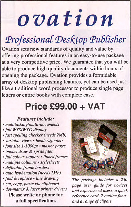
I'll leave you with a smaller Ovation advert from The Micro User in January 1992:
Your comments:
Please note that while I check this page every so often, I am not able to control what users write; therefore I disclaim all liability for unpleasant and/or infringing and/or defamatory material. Undesired content will be removed as soon as it is noticed. By leaving a comment, you agree not to post material that is illegal or in bad taste, and you should be aware that the time and your IP address are both recorded, should it be necessary to find out who you are. Oh, and don't bother trying to inline HTML. I'm not that stupid! ☺ ADDING COMMENTS DOES NOT WORK IF READING TRANSLATED VERSIONS.
You can now follow comment additions with the comment RSS feed. This is distinct from the b.log RSS feed, so you can subscribe to one or both as you wish.
David Pilling, 16th November 2015, 03:28
I used the Sophie Wilson editor 'twin' for all my stuff. And yes it was on horrible monitors. Even expensive monitors were horrible then.
As to Unicode - doesn't doing it that way stop people using existing high bit characters, say in documents they have made previously.
I can see it is an elegant way of doing things though.
For OP I coined a new code in the text and followed it with the Unicode character.
David Pilling, 16th November 2015, 03:29
Oh yes the Beebug spell check dictionary was 60K
David Pilling, 16th November 2015, 03:32
Err you might be right, it says 60K words in that advert... yeah 2 or 3 bytes per word. And didn't the CC spell check take up 128K or something as a module.
Bleurgh, 17th November 2015, 19:28
The source code is messy. When are you going to fix it?
The IT Guy, 19th November 2015, 09:12
I'm with you on the indentation, I always write in the first style (with a 2-space indent) for any language that uses braces. C, PHP, Javascript, and even CSS.
Speaking of CSS, did you know that virtually all browsers can be told to shrink an oversize image with CSS? Just include this in your global CSS file:
Normally this will appear to have no effect. But if someone resizes their browser to less than the pixel width of the image, the browser will scale down the image so it doesn't trigger a horizontal scroll bar. This is of huge benefit on mobile devices. Clever, huh?
Rick, 19th November 2015, 21:47
Thanks for the CSS suggestion. For mobile devices, the images in mobile mode are scaled down and encoded at a lowish quality to keep the file size down. This might seem to suck, but it is off huge benefit on EDGE / 2G networks. On 3G or 4G, most modern devices are capable of putting in a good attempt at the regular non-mobile version, indeed it is patched to do that anyway for the iPad...
This web page is licenced for your personal, private, non-commercial use only. No automated processing by advertising systems is permitted.
RIPA notice: No consent is given for interception of page transmission.